IU Parking
“IU Parking” is an application that assists IU & IUPUI students, faculty, and staff find available parking on campus.
In this application, users can perform a few tasks all revolving around finding available parking on campus. Users can review information about a parking location, such as address, number of available spaces, permit types, distance to location, and review available parking spaces. Users can also inspect a map of campus with parking locations designated. Users cannot save parking spaces, only see a preview of the latest update on availability.
Client
IUPUI
Role
Design,
Research
Date
November 2020
Tech
Figma
User Experience
User Persona
I chose to interview current students at IUPUI who commute to campus (or commuted to campus recently). The demographics came out to be roughly the same from individual to individual: full-time student with a job, young, female, white, single, has siblings, and has no disabilities.
Each interviewee is dedicated to school and takes it seriously. All live off-campus but are within a reasonable distance to commute every day. All are capable when it comes to operating technology, especially a mobile phone and a personal computer. They are generally creative and adventurous, disliking dishonesty, tardiness, close-mindedness, and bad user experiences.
Finding parking on campus is an issue for interviewees. They all have to make an effort to plan and arrive on campus early to find a place to park.
Due to the COVID situation, I was unable to interview Employees at the time of this research.
Activity Diagram
Low-fidelity Diagrams
User Testing
Testers
I believe these individuals are target users as they are all either students or staff of Indiana University.
Because of the current situation with COVID-19, it wasn't easy to find people to test with in person. As such, I had to be a bit more open-ended when looking for testers. Participant 1 is an IUPUI student. Participant 2 is a student at IU Bloomington but has been to the IUPUI campus on a few occasions. Participant 3 is a staff member at IU Bloomington but has been to IUPUI for work on many occasions.
Although the testers differ slightly from the exact target audience, they can still be considered target users with their knowledge and being commuters. All participants also have many hours of experience using map applications.
First Test Findings
Overall, the prototype of the parking application worked well. There were a few issues that participants ran into during the test sessions, but they could complete the task with confidence and satisfaction.
The participants said that the task of finding an available parking space was straightforward. However, it appeared that there might be a short learning curve to the application. There was some confusion with how the features are organized. Besides that, participants thought that the application was generally simple, not overly complicated, and provided almost all the information they would like to see when performing the given task.
Out of all the usability issues found, I do not consider any of them detrimental to the application's functioning. There are many frustrations and misunderstandings, but nothing overly critical.
The most significant issue discovered is that users try to tap on an available parking spot, nothing happens. However, they want to see more information about the desired location. This became quite frustrating for two of the users. It even led to a slightly higher degree of anger until they conceded in frustration for one participant. I rated the issue a 3 (serious issue).
The second-largest issue discovered is that users were somewhat confused by the map and garage/lot diagrams' orientation. This became a considerable frustration for one user and confusion for the other two. Two of the participants assumed that it was oriented so that the top of the map was facing north. Still, they did not feel confident in that conclusion. Participant 2 expressed a higher frustration level without cardinal directions or nearby building names. Although they are not as familiar with IUPUI’s campus as an IUPUI student or employee would, I believe this still could become an issue for them. Particularly new students and employees and individuals who struggle with directional awareness. I rated the issue a 3 (serious issue).
The third issue is that users attempted to see details about a location when tapping on it on the map. I listed this as a lightly less critical issue since it appeared more annoying than frustration or a detrimental problem. I rated the issue a 2 (medium issue).
The fourth issue is not as severe as the others since it was merely confusion. Users were unsure about the difference between the home screen and the map screen. Participants did not seem to express frustration or annoyance at this. They were confused and did not understand the difference, bouncing between the two screens to see how it differs. Only one participant saw the design's intention, but it took a little time to realize. I rated the issue a 2 (medium issue).
The last issue found is that users found the colors on the map slightly confusing. They did not understand the meanings of the colors overlaying the locations. I decided to declare this as a medium-level issue because I can see it becoming a frustrating and even dangerous problem for users. Users need to be able to process the information on the map quickly.
Even though using a phone while driving is unsafe and not recommended, people will continue to do so regardless. Thus, it is crucial to minimize the amount of time a user needs to look at the screen as much as possible.
Revisions
Home Screen:
The map has been expanded, and the map screen has been removed. The functionality has been merged with the home screen to eliminate confusion between the two screens and require less user navigation. Because of that, it now contains the functionality of the previous map.
The map now has a search bar, direction indication, zoom in and out buttons, "go to my location" button. The list of locations has been edited as well to accommodate the map. The section can be dragged down to increase the size of the map.
Other changes: updated time now bold to increase visibility, distance to location text enlarged to increase visibility, and garage abbreviation removed as it confused the student participants.
The map should be simplified to make it easier for users to process. Names of locations should remain, and the indications over lots/garages should be one color. The university should complete this.
Favorites / All Parking:
Card/List view buttons increased in size to make it easier to tap.
Location Diagrams:
Direction indicator and zoom buttons added.
Now when selecting any spot, a details popup appears.
University should provide correct blueprints of garages/lots that can be turned into an interactive map/image.
Location Diagrams:
Popup created. It appears on the screen when selecting a spot in a parking location. Lists spot number, availability, permit type, and if it is or is not a reserved parking spot. Popup can be minimized by tapping the "x" or anywhere on the screen.
Screens
After the analysis, I revised the screens to represent the final version in this project. This is certainly not the final version overall, as this was the result of only the 1st round of testing.
If given the opportunity, I would conduct further testing to develop better screens and a final version of the application.
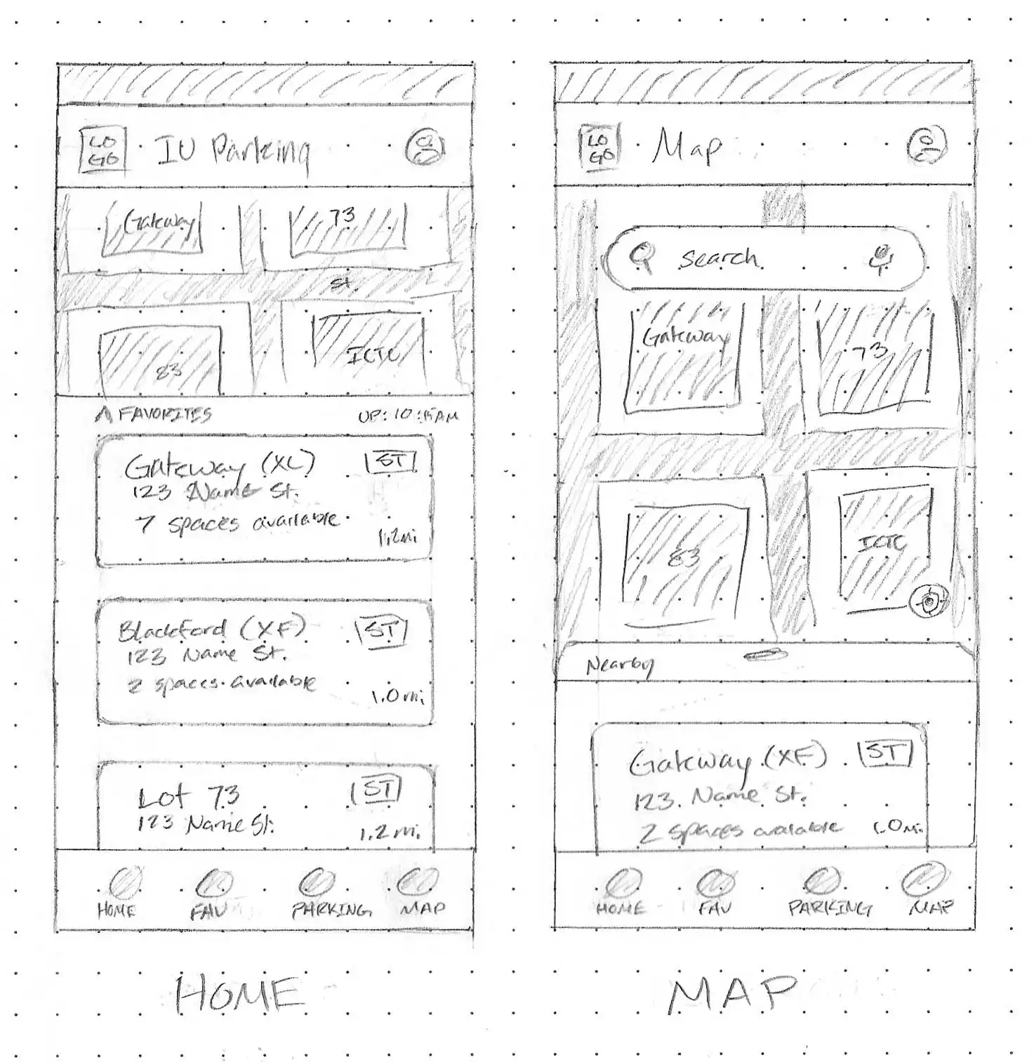
Home Screen
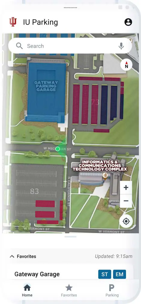
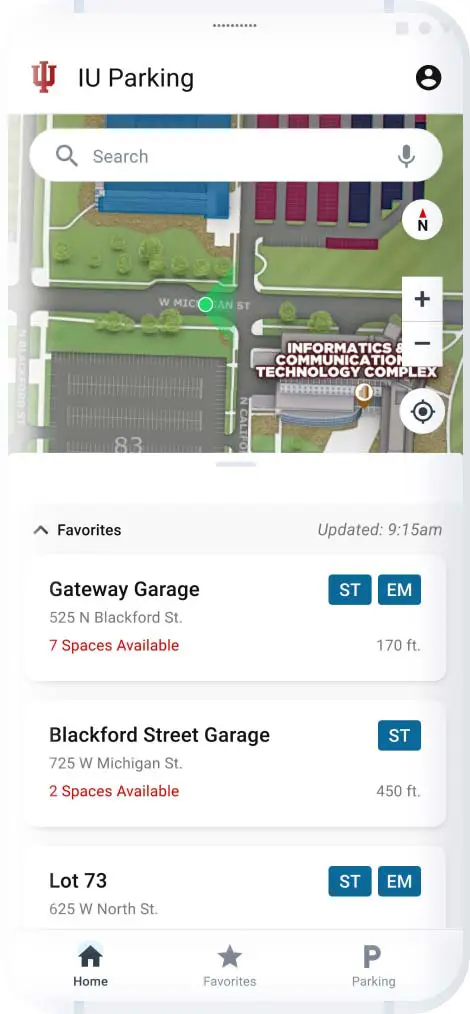
On the Home Screen, users are met with a map and their favorite parking garages and lots.
Users can interact with the map (unavailable in prototype) like typical mobile map applications: zoom, move around the map, etc. When tapping on a highlighted garage or lot, information about the location will be displayed. Overlaying the map, user's can see which way is north, use zoom in and out buttons, or focus on their current location.
By default, the list of locations is sorted by the user's favorite locations. However, the filter can be swapped to filter all locations alphabetically.
The last sync time is displayed on the screen by "Updated: [time]." This lets users know how up-to-date the application is with the university's parking system.
Parking locations are displayed as cards. Within, users can preview the most relevant information. It contains the location's title, address, number of available spaces, and all permit types at the location. When a location's availability falls below ten spaces, the text turns red.
When a user selects a location, they are directed to a location diagram to review the available parking spaces in the location.
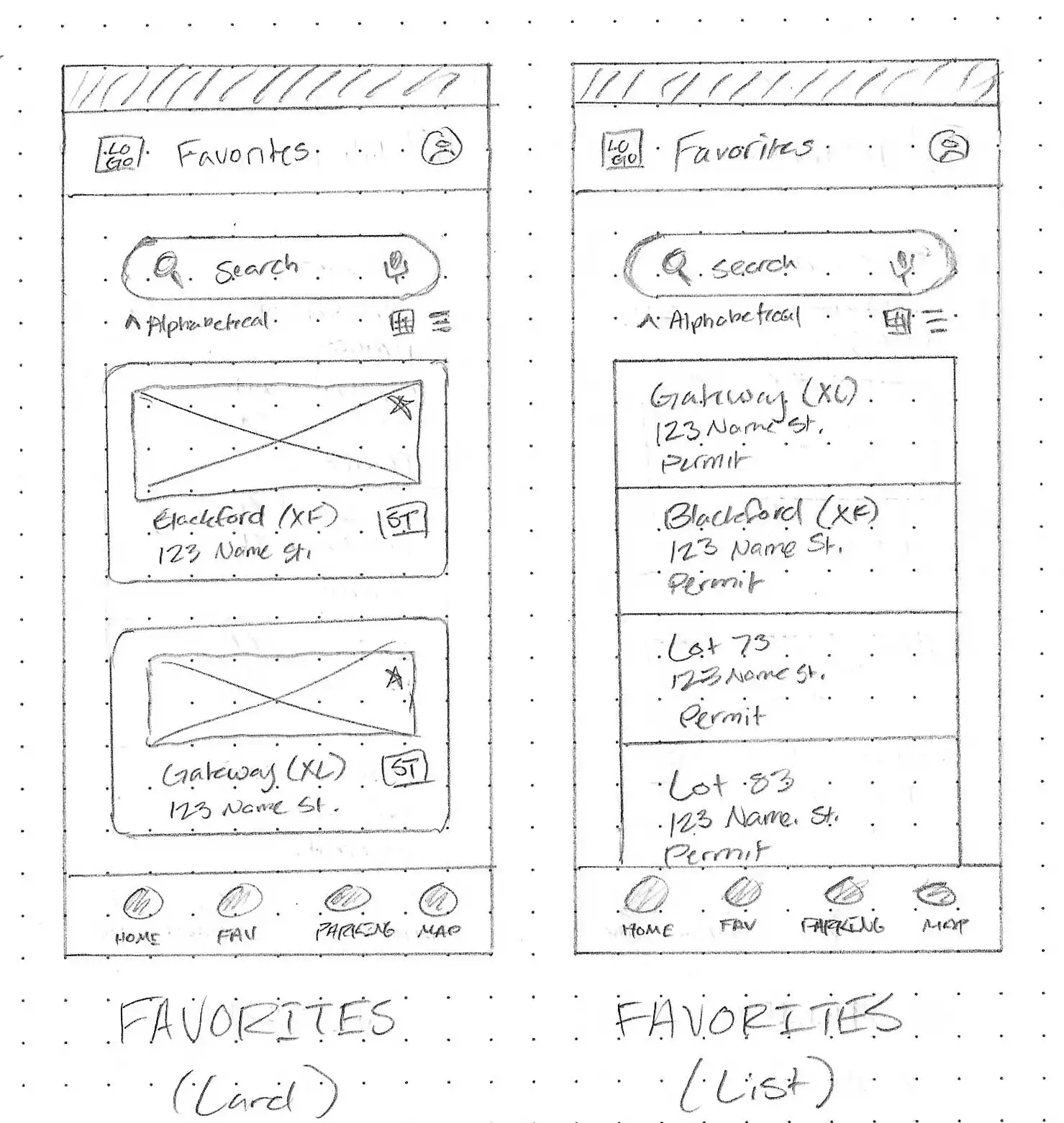
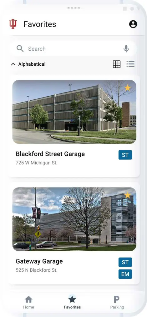
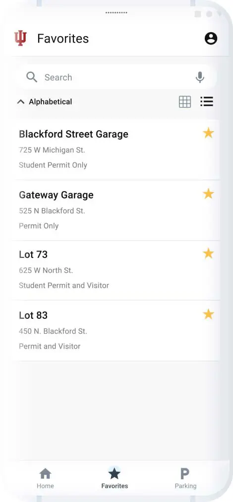
Favorites
Users can view their favorite parking locations here. They can view in a card view or list view. From here, they can preview the availability of their favorite locations.
Listed locations contain the location's title, address, number of available spaces, and all permit types at the location.
Users can use the search function to find a location without manually scrolling down (unavailable in prototype).
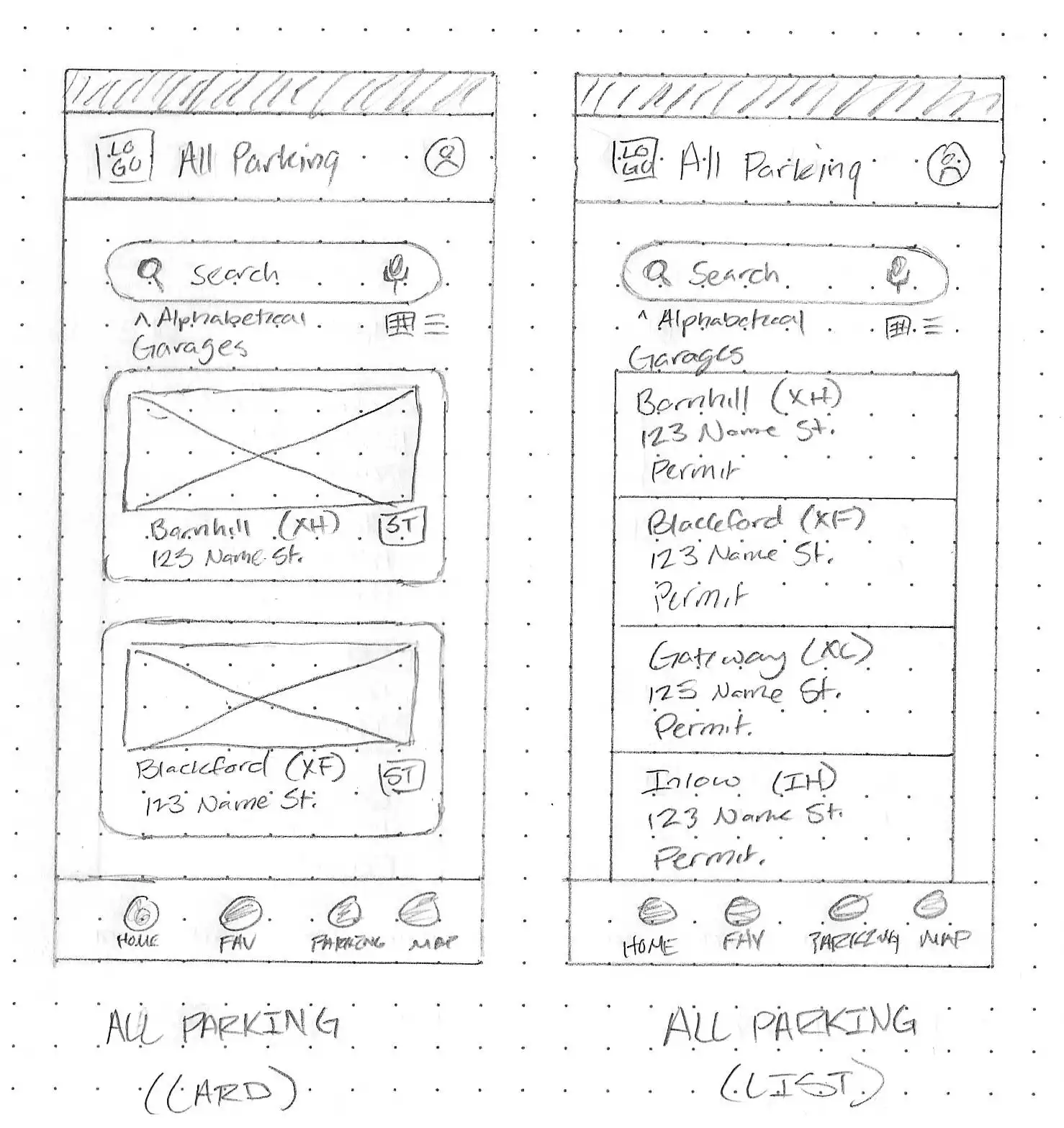
All Parking
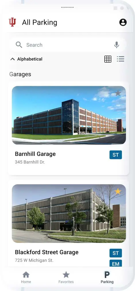
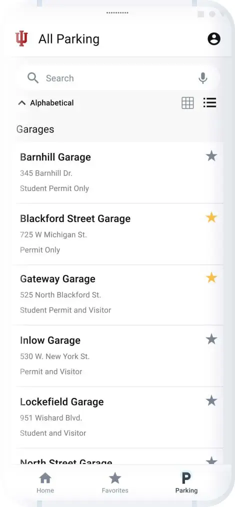
From this screen, users can view all parking locations on IUPUI's campus. They can see favorited and unfavorited locations the same. This is where new users will create their favorites list.
Users can view parking locations in card view or list view. From here, they can preview availability of their favorite locations.
Listed locations contain:
- The location's title.
- Address.
- Number of available spaces.
- All permit types at the location.
Users can use the search function to find a location without manually scrolling down (unavailable in prototype).
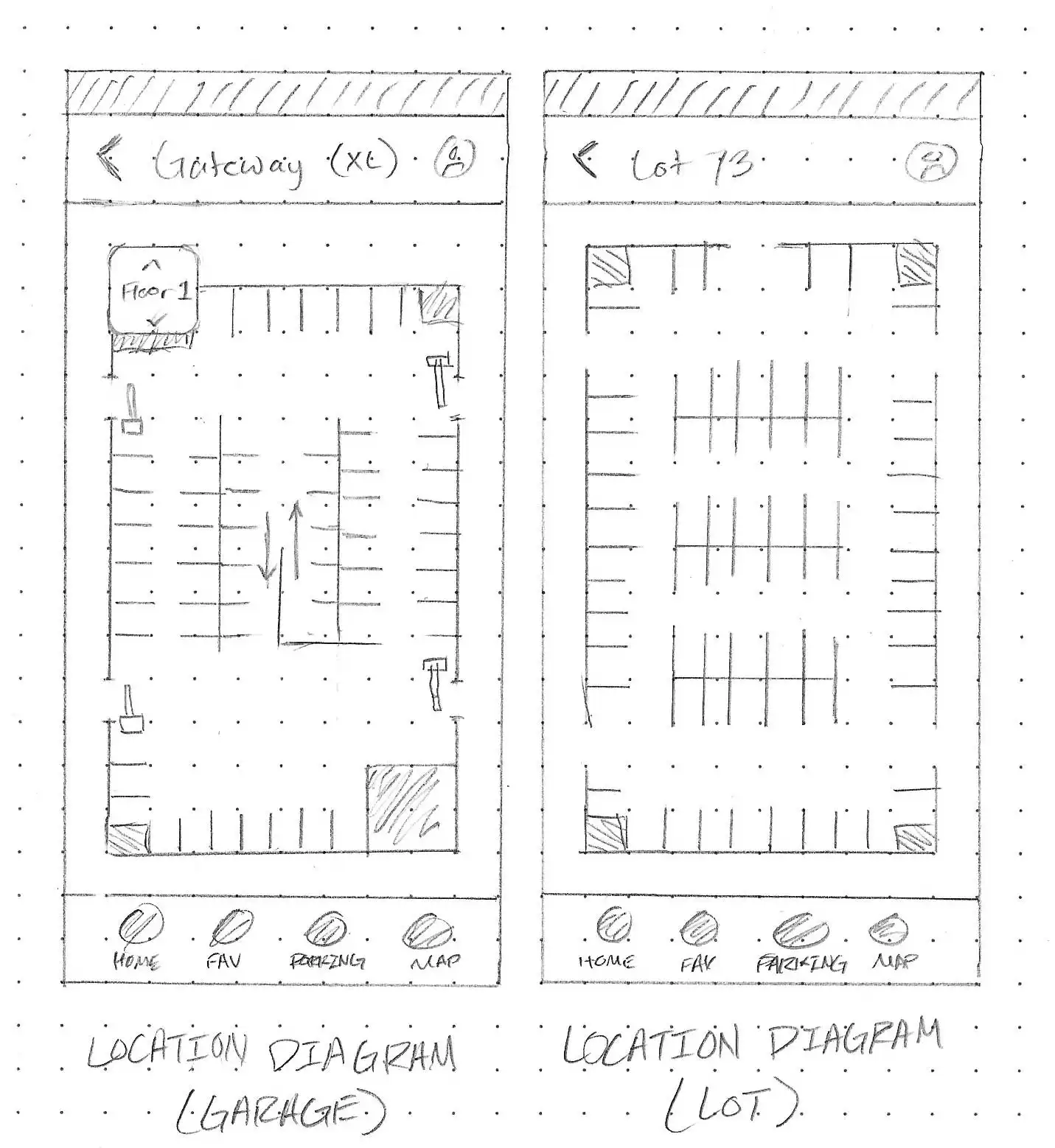
Location Diagram
The location diagram displays an interactive "map" of the parking location. On this screen, users can see all parking spaces. Available spaces appear in green, while unavailable spots are gray.
When a user taps on a parking spot, they can preview details about the spot. The details listed are the spot number/name, availability, permit type, and if it is reserved or non-reserved parking.
If the diagram is of a parking garage, users can navigate the floors.
The diagram has zoom-in and zoom-out buttons, as well as a directional indicator displaying north.